
Specialty coffee · Colorado Springs
Juniper & Stone Coffee Co.
Website design · Ecommerce UX · Design system
A place-rooted ecommerce site for Juniper & Stone — long-scroll homepage, seasonal shop, and product detail frames that extend the brand into digital.
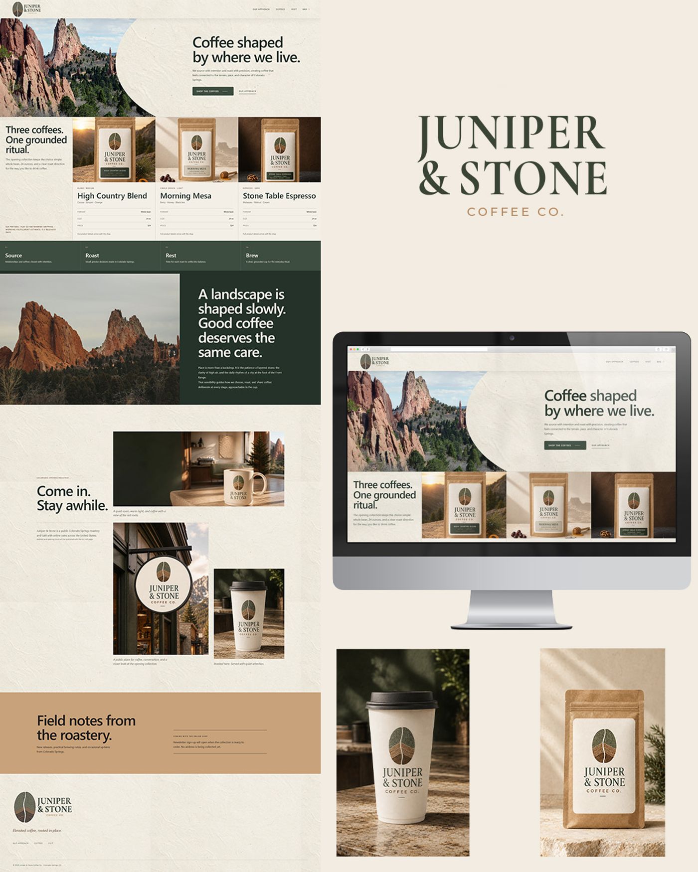
A storefront rooted in place
With the Juniper & Stone identity locked, the website had to carry the same Front Range restraint into ecommerce — cream fields, forest green structure, and photography of red rock and ritual coffee. The work spans homepage storytelling, seasonal shop browsing, and a product detail path that makes tasting notes feel as considered as the roast.
This case study focuses on the digital product: desktop page system, long-scroll homepage composition, and how packaging language lands beside the UI. A live walkthrough video will be added once the demo capture is ready.
From IA to detail
- 01
Structure
Map the shopper path — home, shop, product detail, visit — so seasonal coffee and café visits share one calm hierarchy.
- 02
System
Translate brand type, palette, and mark into Figma components for nav, product cards, filters, and PDPs.
- 03
Compose
Build the long-scroll homepage: hero, three-coffee ritual, Source–Roast–Rest–Brew, landscape story, and visit gallery.
- 04
Detail
Finish shop and product frames so tasting notes, grind options, and add-to-cart feel grounded rather than template ecommerce.
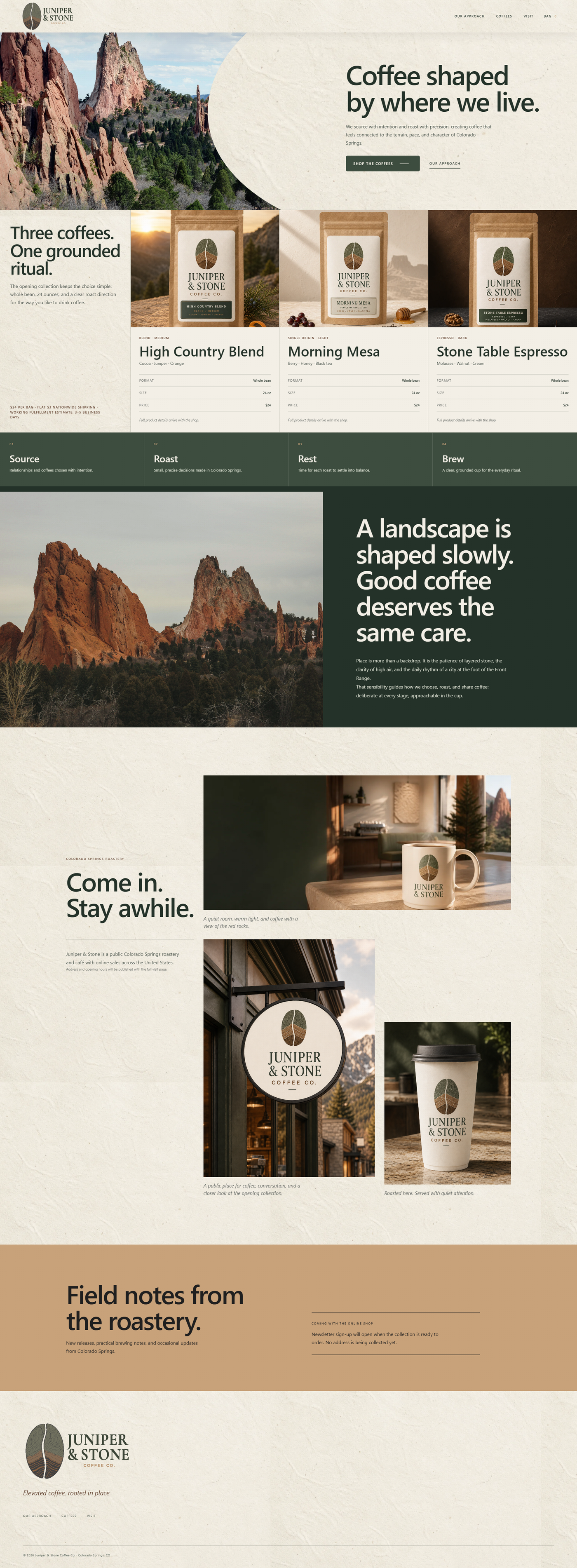
Homepage — full scroll composition

Desktop page system
Home, shop, and product detail share one Figma system: serif headlines, forest-green CTAs, and product cards that keep origin and tasting notes readable. Filters and PDP options stay quiet so the coffee — and the landscape photography — stay loud.


Brand on screen and in hand
Walkthrough video
A recorded website demonstration will live here as a Video module once the capture is ready — uploaded directly in Sanity alongside these frames.
Credits
- Website design
- Thrun Design Co.
- Tools
- Figma