
Specialty coffee · Colorado Springs
Juniper & Stone Coffee
Brand identity · Visual system · Packaging · Website
A from-scratch specialty coffee brand — topographic mark, packaging language, and digital storefront rooted in Colorado Springs.

Built from a blank slate
Juniper & Stone Coffee Co. needed a complete brand before the first bag shipped — mark, system, packaging language, and a digital storefront rooted in Colorado Springs. The brief was place-first: Front Range light, red rock geology, and the quiet ritual of a daily cup. Nothing existed to evolve; every decision had to invent the voice and make it feel inevitable.
We designed the identity end to end: a topographic coffee-bean mark that reads as both landscape and roast, an earthy palette of forest green and layered stone, lockups for cup and signage, and a website that carries the same grounded restraint from hero to product detail.
From place to system
- 01
Discover
Map the landscape metaphors — juniper, layered stone, Front Range ritual — and the tone of a specialty coffee brand that feels local without becoming costume.
- 02
Mark
Shape the bean as a vertical icon: topographic contour in the crown, sediment bands below, center fissure as a quiet mountain peak.
- 03
System
Lock type, palette, and horizontal/wordmark lockups so packaging, signage, and web share one artisanal voice.
- 04
Apply
Extend the system into ecommerce frames, kraft bag labels, takeaway cups, and an exterior hanging sign.

A bean that holds the landscape
The mark splits like a roast fissure. Upper contours suggest juniper growth and topo maps; lower bands read as stone strata. Forest green, terracotta, and charcoal keep the icon warm and grounded — readable at cup size and on a hanging sign.


Foundations — mark study, Illustrator lockups, and Figma system frames
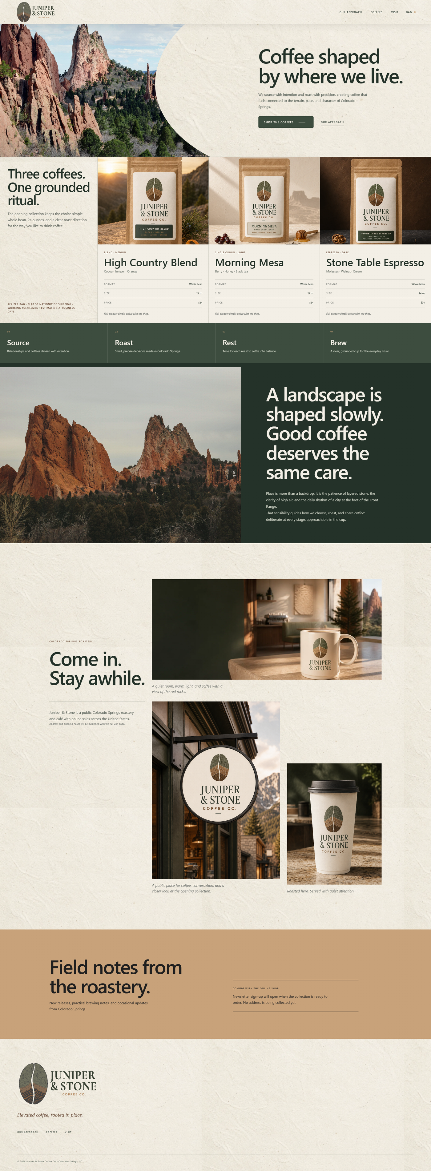
Digital product — full site composition


In the world — brand board, cup, and storefront sign
Credits
- Brand identity & digital design
- Thrun Design Co.
- Tools
- Illustrator, Figma