
Architectural furniture · Concept
Hollowbeam
Website design · Product configurator · Ecommerce UX
Ecommerce and configurator UX for Hollowbeam — homepage, HB-S1 product detail, and a 2D system builder.
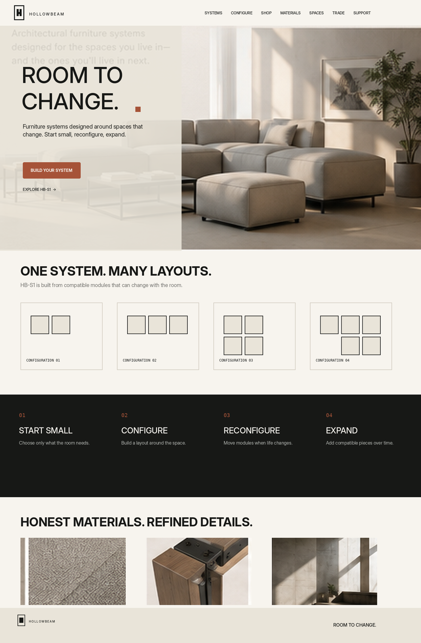
Room to change — on the web
Hollowbeam’s site turns modular seating into a clear path: explore the system, configure a layout, and land on a product detail that still feels architectural. Warm plaster fields, Oxide CTAs, and monospace specs keep the digital experience aligned with the brand sheet.
Key surfaces include the homepage narrative, HB-S1 product page, and a 2D configurator for building L-shaped systems with live dimensions and pricing.
From story to system builder
- 01
Story
Homepage hero and process strip — start small, configure, reconfigure, expand.
- 02
Product
HB-S1 detail page with starting configurations, materials, and compatible additions.
- 03
Configure
2D workspace with module adders, fabric/frame controls, and a live system summary.
- 04
System
Carry UI kit tokens — Oxide primary, plaster surfaces, mono data — across every frame.


Homepage — room to change

HB-S1 product detail
Starting configurations, material swatches, and a Build Your System CTA lead into compatible additions — corner, ottoman, side table, storage — so shoppers see the system, not a single SKU.

Configurator — build your system
Credits
- Website & configurator design
- Thrun Design Co.
- Tools
- Figma